NB! Japanese Format. Reads Right to Left
Ashling has some kind of magic neck-lace? I wonder what that does? 😀
Part 11: Being kind to the reader
Another thing Nao taught me is something that you would think would be easy, but it is not.
It goes without saying that a cartoonist should always have the reader at heart whenever he or she draws up a page. A good cartoonist should always be gunning for a good easy-to-read & follow experience for the reader. However, in practice this is easier said than done.
I always assumed that simply enjoying the process of making a comic was enough to transfer that joy to the reader. ‘Enjoy what you are doing and show it’ But there’s more to it, as I would learn from Nao.
In professional Manga production, there are two methods employed that are designed to make the reader’s experience effortless on their part.
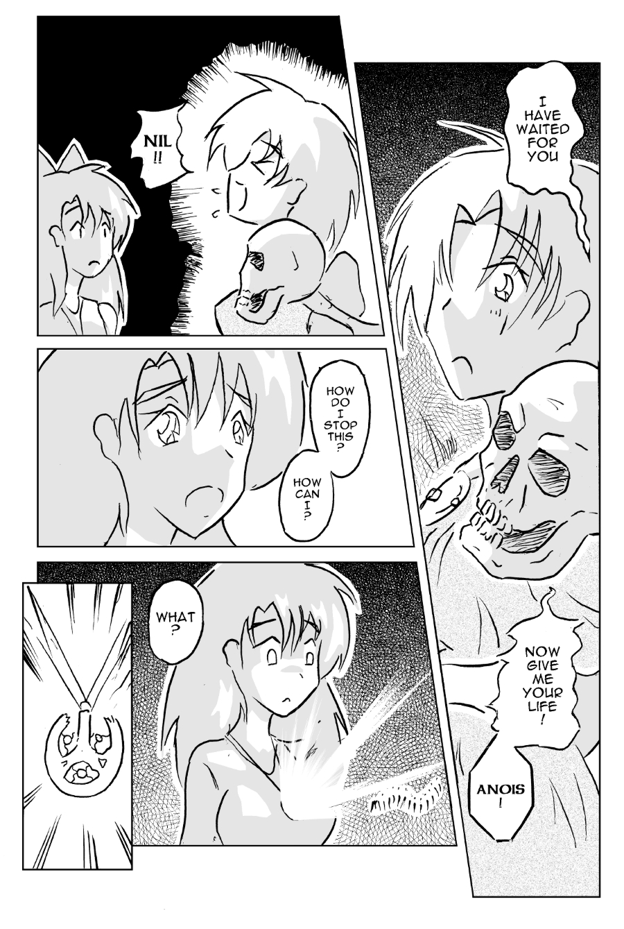
First is layout and pacing. The page needs to be arranged in a way that isn’t too cluttered, with plenty of room to show the pages more important elements, and to *clearly* show the reader what is going on. Part of this was Nao’s suggestion to limit the amount of panels used to 5-6 max. I would often use more, which can result in a cluttered page and less space to show what’s going. Keeping things de-cluttered and clear makes life much easier for the reader, who doesn’t need to put unneeded energy into concentrating. Also, the angle, size, and gap between the panels also reflect how ‘fast’ things are happening and good management here can really help in the reading experience.
The second, is how to ‘lead the eye’. This is an essential skill to making things easier for the reader. What I had learned is that the position of the speech bubbles, and the very ‘direction’ of the action need to fit together into one coherent flow. If you look at my page above, you can see that I am practicing this. The first column of text on the top right is designed to lead your eye down from the first bubble, past Aine’s scared face, past the skelton, and then stop at the second bubble. If this is how your eye natually travelled, then I did my job right.
Part of this was down to the elements of the panel itself. Right after the first bubble you will see that Aine’s eye is pointing down. That was related to the scene itself, but it was also designed to send you eye south in the direction I wanted. The arrangement of the second row of speech bubbles was arranged into a sort of ‘S’ pattern. This was done so that your eye wouldn’t need to suddenly stop and change direction mid-scene.
Tricks like this was part of what Nao described as being ‘kind to the reader’, to gently take them by the hand and lead them through your page. This kind of care is something I consider to be the hallmark of a good manga-ka. And so, it is yet another thing I now work on, thanks to Nao.
Next week: The Heart of the Manga


And now: The star of our show! 😛